Everything works
We make it easy for you to get our content and services on all your devices.
Universal
We apply universal design principles, so anyone on any device can make the most of our content and services
- Do your research - understand user needs and make sure you’re meeting them by testing designs and their implementations on real users
- Follow in-house design and UI patterns
- Optimise forms and inputs so that minimal effort is needed to use them
- Keep the user experience of native apps consistent with the official design patterns and guidelines for the platform
- Follow our Accessibility Policy and take advantage of the support provided by native platforms
Adaptive design
Our designs adapt to your devices and the way you use them.
- Maintain high frame rates and minimise the latency of interactions to make the user experience feel fluid
- Use visual feedback to increase perceived performance
- Minimise network latency and cache resources intelligently
- Build products in stable environments
- Respond rapidly to bugs and issues
Everything everywhere
You get the same features and the same content across all your devices.
- For web, be device agnostic. Use feature detection & progressive enhancement to deliver the richest experience possible
- For native apps, aim to deliver all features & content across all devices. It’s fine to adapt as necessary, but avoid omitting entirely
Sync seamlessly
Your Which? preferences and data automatically sync across all your devices.
We give users:
- Automatic sync whenever something changes
- Intelligent sync that carefully manages use of bandwidth and power
- Visibility & control over the sync process in a way that is minimally disruptive to user experience
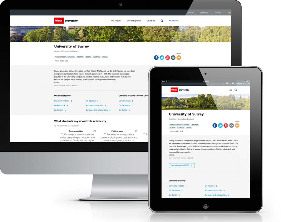
Adaptive design: The layout of the Which? University site adapts to different screen widths